How to use open-source data to create visualisations on Flourish
Ruby shows you how to find publicly available data, make it squeaky clean on Excel, put it into a chart or graph which you can then use to create an exciting data-driven story.
A few weeks ago, Beth and Miles from the Mo-Di Journo team created a long list of places you can find useable data. As long as you have an active internet connection, you can find it with ease. This will come in handy through your journalist career, as data sets are a great place to look for stories.
We thought we would expand on their “Idea Generation, Sourcing Data and Visualisations” story by taking you through the process of sourcing data online, cleaning it on Microsoft Excel and visualising it on Flourish. It’s good to know your way around Microsoft Excel spreadsheets so when a story crops up, you can sift through it quickly!
This week Ruby teamed up with Marieta Marinova from the Interhacktives who will be taking on a similar data set. Instead of using Microsoft Excel, she’ll be showing us how to use RStudio, another software favourite in the data journalism industry.
We’ll outline everything from sourcing your data to cleaning it and then creating an eye-catching visualisation. From our data we want to find out the number of payments made to each service over six months and the amount paid to each service. This will become clearer later on.
Note: All keyboard shortcuts are for Mac computers, so Microsoft Windows shortcuts will vary.
Find your data
The internet is full of places where you can find workable ‘open-source’ data. Open-source data just means it is readily available to the public and to us as journalists. The best part about it is that it’s all online and (usually) free. This includes government databases, the Office for National Statistics (ONS) and data gathered after doing a Freedom of Information (FOI) request.
Step one: Find and download your data sets
We took ours from the Manchester City Council website, specifically looking at the council’s ‘Expenditure exceeding £500’ over a period of six months.
We have taken data from October 2021 to March 2022. Once downloaded, you will have six separate sheets of data.
Step two: Combine data sets into one sheet
To combine them into a single Microsoft Excel document, open each of the documents one by one, select the entire data spreadsheet (or press ⌘COMMAND + A on a Mac to highlight the entire sheet), then copy it onto your clipboard (press ⌘COMMAND + C) and paste it into a brand-new Excel spreadsheet (press ⌘COMMAND + V).
If you don’t want to use the keyboard shortcuts, don’t worry because we’ve got you covered. Highlight the entire sheet by clicking the button in the very left of the sheet then go into Edit -> Copy and Edit -> Paste into a brand new Excel Spreadsheet.
Make sure you save this new spreadsheet as this will be the one you use to combine all six data sets. I named mine “MCC Expenditure Oct 21 – Mar 22”
Now you have combined all six data sets into one sheet.
Clean your data
Some of your data will come to you in an unusable way. This means it will be full of spelling mistakes, odd punctuation, unnecessary rows and columns and even duplication. So you’ll have to figure out a way to clean it which can take time unless you’re familiar with Microsoft Excel.
Step one: Remove column titles
When we combined data from six data sets into one, we also copied over the column titles from each sheet. To remove them, use the ‘Find’ feature (or press ⌘COMMAND + F).
For our data, I searched for ‘Body name’ then deleted that row as it had no numbers in it.
Step two: Freeze Top Row
This will make it easy for you to scroll through the data and know what you are looking at. To do this, click on View -> Freeze Top Row
Step three: Add a Filter
Highlight the entire sheet again using ⌘COMMAND + A then from the Home tab -> Sort & Filter or go into Data tab -> Filter (or funnel icon)
Step four: Remove columns which are the same
It’s best to keep it simple so remove any columns which bring up the same thing in the filter. I’ve removed ‘Body Name’ as it is Manchester City Council for all the data.
Step five: Filter the data
As our data set has more than 10k entries, I have chosen to look at spending on ‘Environment and Operations’. To filter this, click the arrow next to ‘Service Area’ and select this option.
Then copy this into a brand new tab so that you’re only ever looking at Environment and Operations, not all of the data from the original data sets. This is known as ‘extrapolating’ the data you will use.
Step six: Remove duplicates
Sometimes you will need to create a list of all the suppliers without trudging through and copying each one individually.
A quicker way to do this is to copy the column which says ‘Supplier Name’ and put all of that into a new tab of the spreadsheet. I’ve named mine ‘Services’.
Then highlight it, go into the ‘Data’ tab -> Remove the Duplicates. This will leave you with the overall suppliers that Manchester City Council made payments to.
Asking your data some questions
Here is where the journalism bit kicks in. You need to ask the data some questions so that you can create a data-driven story out of it.
See our post from a few weeks ago if you’re unsure of the kinds of questions to ask.
My chosen questions are:
How much did Manchester City Council spend on Environment and Operations between Oct 2021 and March 2022?
Which suppliers did MCC make payments to in this time?
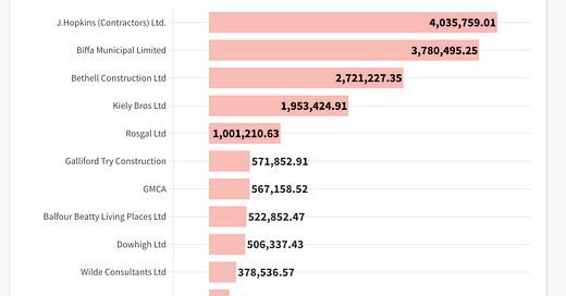
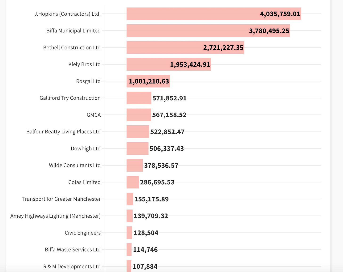
How much did MCC pay to each company?
How many payments were made over a six-month period?
To answer these questions, we need to create two formulae.
Step one: COUNTIF formula
This formula will count the number of cells that meet your criteria. For our MCC Expenditure data set, this will count the number of payments made to each of the suppliers.
Formula: =COUNTIF (range, criteria)
Our formula: ‘ =COUNTIF('Environment & Operations Data 2'!G:G,Services!A2) ’
Step two: SUMIF formula
SUMIF formulae will add the values in a range for you as long as they meet the criteria. For our MCC Expenditure data set, this will add the payments made to each of the suppliers for you.
Formula: =SUMIF (range, criteria, [sum_range])
Our formula: ‘ =SUMIF('Environment & Operations Data 2'!G:G,Services!A2,'Environment & Operations Data 2'!F:F)’
Once you’ve figured out one formula, Microsoft Excel does the work for you. Just drag down the bottom right corner of the cell with the formula in it, and Excel will work out the rest.
Visualise into a graph
After getting the answers to your questions, all that is left is to put them into a neat and shiny graph, chart or even a map.
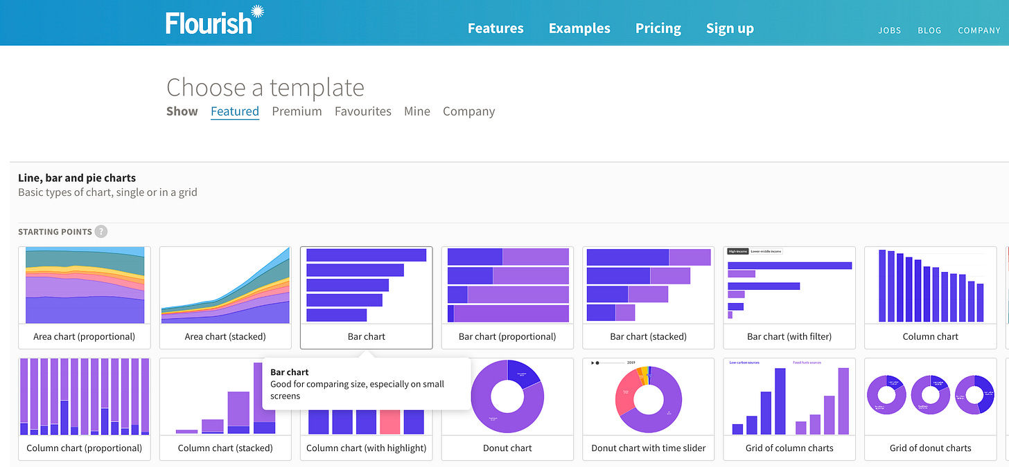
The information we have lends itself to a bar chart so we’ve chosen that. If we were comparing payment amount from Oct 2021 to March 2022, we might be better off choosing the stacked bar chart.
Then you’ll be given a preview of a bar chart with some general data added as an example. Click the Data tab to upload your own data set.
The data will appear like this.
Selecting ‘Preview’ will allow you to see it in action, and you can alter as necessary. From this data, I can create the bar chart from the number of payments made to each supplier, to the amount that was paid to each supplier over six months.
Visuals of both number of payments and amount paid are given in the graphs below.
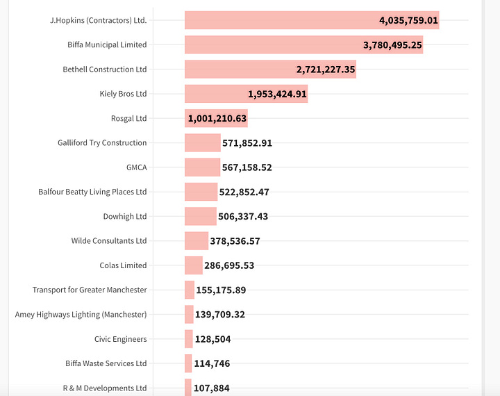
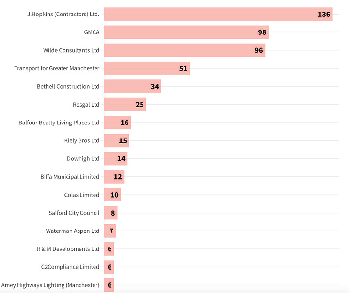
The possibilities of what you can do with Flourish are endless when it comes to turning your data into eye-catching charts and graphs.
Here’s a video which will take you through these steps along with a tutorial on RStudio, but at a faster pace (so slow it down if you need to).
The possibilities of what you can do with Flourish are endless when it comes to turning your data into eye-catching charts and graphs.
Here’s a video which will take you through these steps but at a faster pace, along with Marieta’s tutorial on RStudio.
We hope this helped you in your journey to becoming fully-fledged data journalists. Let us know what you think in the comments section below.
Bye for now!

