


Idea Generation, Sourcing Data and Visualisations
This week we look at how we come up with data journalism pieces, where we find the data we need and how we make it look great!


Hello everybody!
This week it’s Miles and Beth at the helm of the MoDi Journalism team’s newsletter, and we’re looking at some more data journalism. Specifically, we’re building our understanding of how we create data driven stories, generating ideas and sourcing official data to interrogate.. We’re also sprucing up our spreadsheets and prettifying our pivot tables with data visualisation.
Flip your story!

One of the best ways to generate a piece of data journalism is flipping an idea you already have.
Let’s take a statement we used in class to show what we mean - “festivals are getting too expensive… and it always rains”.
How do we get a data story out of this? We simply flip the statement, and try to extract as many questions as possible from it, all of which can be proven or disproven with data.
Some example questions we can draw from “festivals are getting too expensive”:
If the prices of tickets to festivals is increasing, by how much?
How does the increase in festival ticket prices compare to increased pricing for other ticketed events - sports games, stand-alone concerts, theatre productions, etc?
Can previous attendees still afford tickets that they’ve bought in the past?
“And it always rains”:


How much rainfall is there over the course of festival weekends?
Is the amount of rainfall different at different festivals, on different dates and in different locations?
Which dates of each year are expected to have the least and most rainfall on average - and are there festivals scheduled for these dates?
Each of these questions can form the basis of a unique data journalism story, all of them taken from the same brief statement. The same statement can also be used to design a hypothesis, e.g ‘festival tickets are going up in price at a slower rate than standalone concert tickets’ or ‘Glastonbury Festival gets more sun than Download Festival’, which can then be investigated through data.
This method of story generation is described as “proactive”. Proactive data journalism begins with the idea - you form questions or hypotheses and then seek out data to find out more.
The other method is “reactive” data journalism. Here, the story starts with the data. Maybe a new data set is released, like the census or an ONS report, so you form your story around those new findings. Or, you interrogate a data set in a new way, and what you discover forms the basis for a piece.

Sourcing your data
Whether you have the idea for a story, or you want to draw one out of a data set, your newfound generation skills are of little use if you can’t find data itself.
There’s a number of great ways to find your data, and all you need is an internet connection:
Government Databases
- The Government publish an awful lot of data, some of it a bit dry, but some very interesting - and it isn’t hard to find. The gov.uk website has a wealth of statistics and information that is available to everyone to read and use. A search tool allows you to comb through thousands of different open datasets that have been published by central government, local authorities and public bodies, on topics including crime, defence, education, the environment, health and more.Office for National Statistics (ONS)
- It seems fairly obvious that an organisation called the Office for National Statistics might be a good place to look when you want, well, national statistics. These are the guys that administer the census, as well as offering facts and figures to do with just about anything. Their website has a lot to explore, and they even run a monthly podcast dedicated to all things public data.Charities, organisations and regulatory bodies
- It isn’t just Government and Government affiliated organisations that provide public data. Charities, independent organisations and regulatory bodies will invariably have their own data teams who are happy to share what they know with you - and because tracking down email addresses or phone numbers can be a bit of a faff sometimes even for seasoned journalists, you’ll be delighted to hear that they often package their stats up in colourful press releases (just be careful not to breach copyright law in using them - remember that whilst no-one can copyright data itself, you can absolutely be sued by somebody if you use their fancy graphic without permission). A great example we looked at is the British Beer and Pubs Association, who have a dedicated data and statistics section on their website that’ll make you very thirsty, if not concerned about how many pubs we’re losing on a daily basis.Amateur Databases
- If you’re looking for some slightly more obscure data then you might do well scouring the many amateur databases on the internet. After all, it’s doubtful the Government will ever host a list of all the Star Wars characters and their respective heights in centimetres, but somebody does. Amateur databases are particularly useful in sports journalism, with thousands of budding statisticians who analyse the ins and outs of their sport to be found online.Google Search
- If you’re a bit more technically minded, you probably already knew that you can search Google specifically for spreadsheets. Most of us had no clue, but it isn’t too tricky. Simply search some keywords, for example ‘Manchester, crime, 2000s’ and then enter ‘file: xlsx’ and hey presto, you should have a list of webpages that contain spreadsheets to do with your topic.Freedom of Information (FOI) request
- FOI legislation in the UK means public bodies are legally bound to share certain things when asked. The process can take some time, but is a great way to get information from the powers that be that isn’t already readily available. Ask for answers in a CSV/spreadsheet format in your request and they’ll hopefully package the data up for you.Shared data
- Other journalists will have found their own datasets for you to pick through. Just remember that while the data itself is free rein, straight up nicking their work could land you in hot water!Collect your own
- This final option is easier said than done. For any data you collect yourself to be valid, you’ll need a large enough sample. This is why we don’t recommend relying on surveys or polling unless you’re able to get a good (and varied) number of respondents. You’re not likely going to be able to make any valid claims off the back of responses to a Facebook post, because whilst the views of your friends and family might be useful for certain things, the data won’t be truly representative.
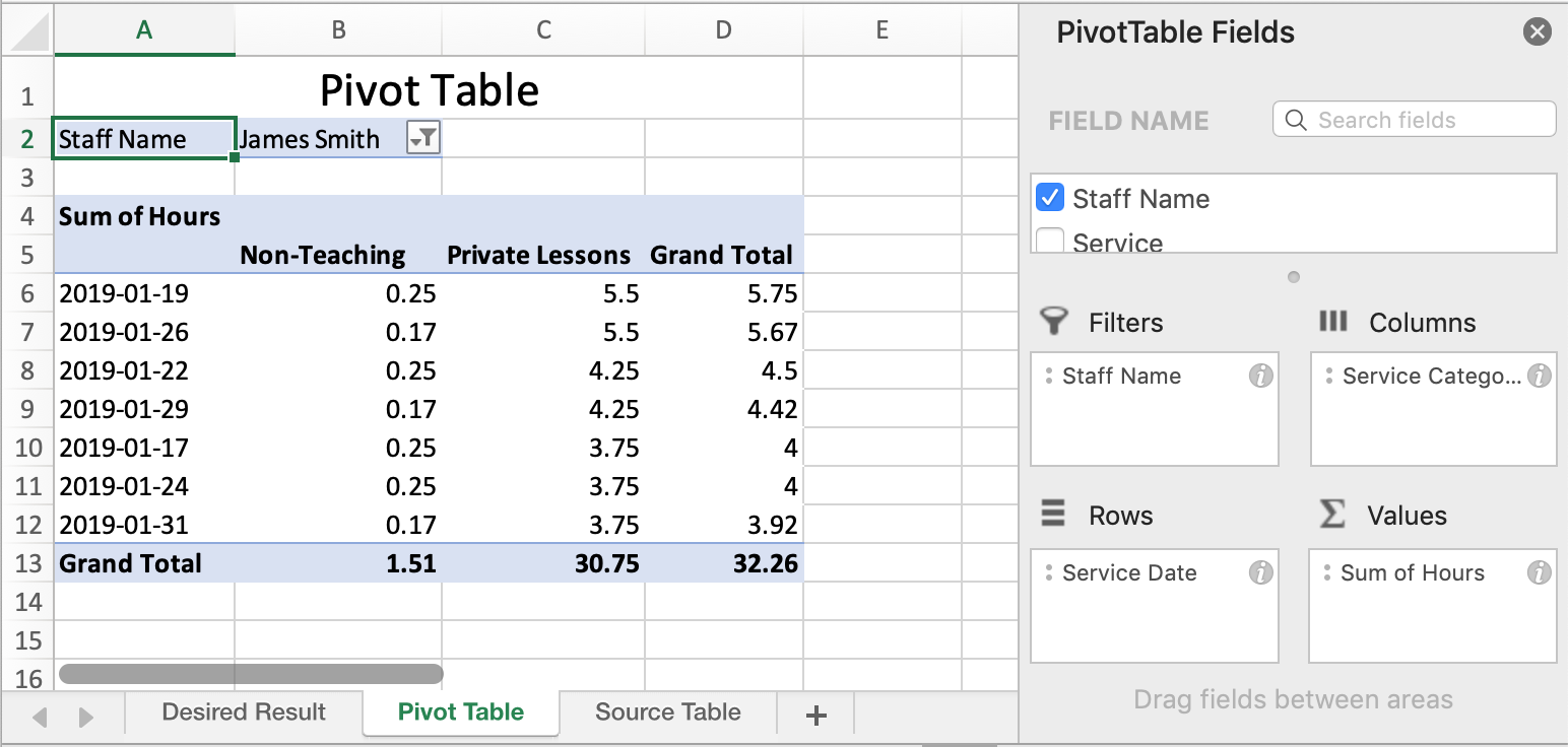
Pivot tables
Where data journalism is at its most creative is the way you package your findings. Every pie chart, infographic and interactive map that is sourced from data didn’t begin in that form.
Invariably it will start as a pretty daunting looking spreadsheet with thousands of individual cells that make drawing any conclusions in this format very hard work.

This is where the magic of the pivot table comes in. It allows you to identify and extrapolate what you really want to know without scrolling endlessly down an Excel page (other software packages are available).
If you are using Excel, taking your raw data and putting it into a pivot table is fairly simple.
Step one: Select all the combined data and then select ‘Pivot Table’ from the ‘Insert’ tab. If dragging to select all the data will take some time, a quicker solution is to press Ctrl + A on your keyboard.
Step two: Select New Worksheet as a location for the pivot table.
Step three: Choose the criteria you wish to collect data from and drag these to either ‘Filters’, ‘Rows’ ‘Columns’ or values to start to fill your pivot table how you wish.
Jazzing up your data visualisations
Whilst that clears up the raw data into something comprehensive, we can make it look better. Excel offers options of different way to visualise your data, for example graphs, bar charts and pie charts.
These are all well and good, if a bit basic. We can certainly be more creative with our visualisations. Luckily, there’s online tools that help you do just that.
One great option is Flourish. It’s free to create an account and offers a lot more style and variety. Browsing their website, you’ll probably recognise some of the visualisations already- the colour coded maps that pop up around elections for example are often done on Flourish.

The best part is that it does most of the work for you - simply select the type of visualisation that you like best, upload your data and let Flourish take care of the rest. Other tools such as DataWrapper are also good and work similarly, if you want even more options.
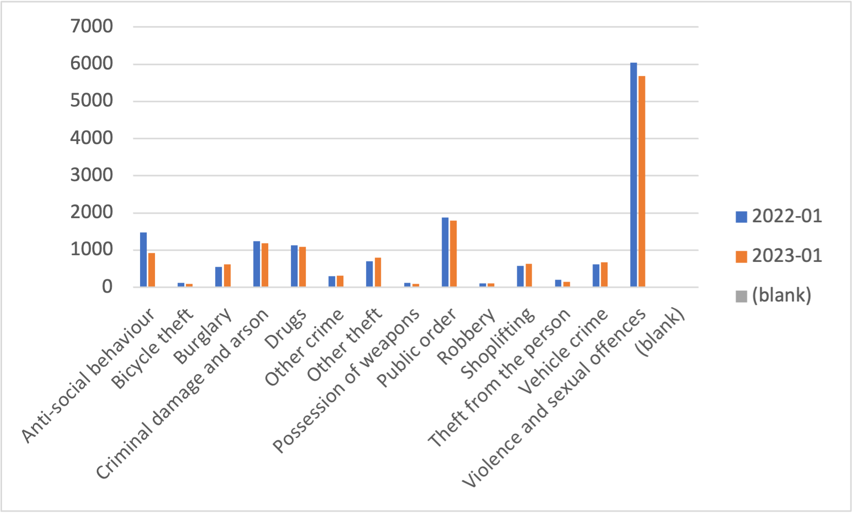
Using Google MyMaps to create visualisations
If you have certain location data, you can create a map. Having mapped data is useful for two reasons: 1) it’s a great source of context for your audience and 2) it’s far easier to identify patterns. Longitude and latitude on a spreadsheet are after all just a bunch of numbers - but when mapped out they make for really interesting data. Mapping also adds another layer of interactivity.
Google’s MyMaps feature is a simple way to do this:
Step one: Go back to Excel and filter the data you wish to include on the map. Make sure this includes location data. It is worth saving this as a separate spreadsheet so you don’t risk losing your work from before.
Step two: Head to MyMaps, select new map, and import your data under ‘Untitled Layer’. MyMaps should hopefully identify the location data for you.
Step three: Create your map and start to tweak it to your preference! You can change your colours and pick from a number of different icons for your markers.
Here’s an example of one we made using data from Merseyside Police.
That’s all from us this week. We hope that with our help you can get your head around the technological ins and outs of data journalism a bit better, and start making your own lovely visualisations!