Welcome to the Mo-Di Journalism newsletter. This week we are talking about everything Data Visualization!
Amber and Emmanuella are our writers for this week! Amber is from the UK, whilst Emmanuella is an international student from Ghana. Here is a comparison of our two cultures using a chart.
This is a continuation of last week's conversation on data journalism. Becky and Megan showed us how to find data and the role of a Data Journalist in a modern newsroom.
Data visualization takes this one step further and shows how journalists can present sets of data to make a story more digestible to the reader.
What is data visualization?
Data visualization is the representation of Data through using charts and infographics. Collected data can be used to illustrate key trends and values in data and compare statistics that can be used on the frontline to instigate positive change.
But how can you tell a story from just a graph?
Last week, in the news the BBC responded to the alarming rise in waiting times across the NHS, using a graph to demonstrate the alarming increase in operation waiting times from 2020 to 2024.
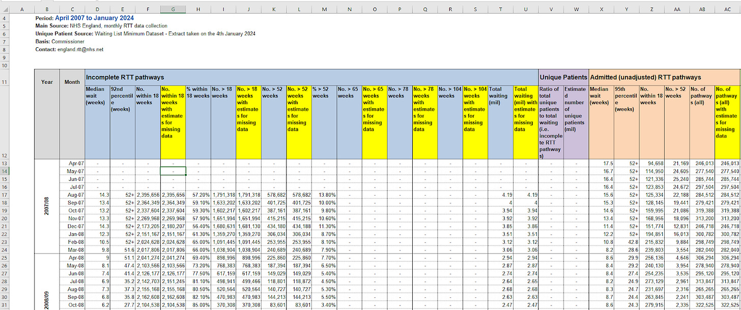
From data collected by NHS England, journalists can take key bits of information collected by a large organization and make it accessible, especially for those without a medical background. By selecting the relevant information, journalists can use these statistics to assess how society functions and use it as a springboard for further investigation.
From this graph, it is evident that waiting times have risen dramatically- so what does this say about the NHS? About the government? About society? For real people who are waiting on potentially life-changing operations?
Yes, the 2020 data is before the coronavirus lockdown before March of that year, but the pandemic has probably influenced our information. What other factors have to be taken into account to understand these key points of data?
How many stories are told from one graph
Remember behind the data, there is a large body of people represented. The BBC says that, as of January, there are 7.58 million people on the NHS wait list for hospital treatment, each with their own experiences. Data Journalism can be a great way to find out about those who really need their stories to be told.
Big spreadsheets can represent the immense scale of data, especially on a national scale, but communicating this information to a wider audience, especially from a Public Service Broadcaster such as the BBC, is far more impactful.

Underpinning numerical evidence with a real human account can add emotional impact and provide the drive that a story needs. In the article, the BBC talks to Liz, who was waiting for a gynacological procedure so long that she had to use private care.
Further hammering the universal problem of NHS waiting times, the BBC also chose to include an interactive element, a postcode tracker of how many people face waiting times at their closest NHS Trust. Here, more localized data is used to compare statistics to the national average.
Even though the data shows that waiting times have gone down since 2023, over 184,000 people are still waiting for medical treatment.
The benefits of data visualization
Here’s a big breakdown of the benefits of data visualization!
Easy to understand
Data is hard, but graphs and charts can help break down large quantities of information and make it accessible to a wider audience. It highlights important information, whilst eliminating the irrelevant parts.
Unlocking the key bits of data
From data, important topics can be analyzed and assessed to give important statistics. These are the numbers that really do matter. For example, according to the OEC, Ghana exports $1.08 Billion in cocoa beans every year!
Identifying patterns
Trends can be shown from complex data that hasn’t been previously displayed before. Journalists can focus on specific areas in information because of this.
Display complex relationships
With new technology, data can present more than just a single set of information. Interactivity can instead provide more meaningful interpretations of graphs.
Attractive and Engaging visualizations
Visualization can be beautiful and can break down large bits of information into sets that are visually appealing. Take for example, data visualization site The Pudding and their analysis on the largest vocabulary in Hip Hop music!
Rappers, sorted by the size of their vocabulary (pudding.cool)
Interactivity and animation
Technology is amazing! And we can use this to create more complex visualizations, using interactive elements. Animations can present more complex sets of trends, to help illustrate the bigger picture.
The future of data visualization
The example below shows the top grossing movies since 1976, with information taken from IMDB. This is a data animation, showing how the landscape of cinema has changed over the years.
This YouTube video was made using flourish.
Using software like Flourish, producing interactive data has never been more accessible. The user can input data into the software and have graphs that give more information than a flat image. Flourish is free and easy to use.
Here’s an introduction to flourish from the developers themselves:
Data Visualization is the future of data journalism. Because technology like Flourish is making graphs, charts, and more complex interactive elements more accessible, we should be seeing more visualizations in the newsroom. The way a journalist perceives data can influence how an audience consumes it.
Remember, a great graph can sum up a story without reading any of the text.


I love the way you start the newsletter with a visualisation of the two countries. Nice touch! Some good examples well explained here. You might also look at how most of the big news organisations now use the coding language, R, to produce bespoke visualisations rather than the off-the-shelf tools like Flourish and Datawrapper. Here's an article about the BBC's R 'cookbook' which they've made openly available https://bbc.github.io/rcookbook/#:~:text=At%20the%20BBC%20data%20team,to%20R%20to%20create%20graphics.