A Beginner's Guide to Data Journalism: 8 Types of Data-Driven Stories
This week, Eve and Shannon walk you through the 8 key approaches to generating a data-driven story to help you find your feet in data journalism.


Data journalism is the new Clark Kent of reporting, playing a crucial role as the world’s online watchdog behind our everyday news stories. Yet, the thought of big numbers, potential maths equations and spreadsheets galore may be intimidating to some at first glance. In reality, you don’t need to be a computer whizz or a superhero from Krypton to excel in data journalism, as it can involve a diverse range of skills and people.
In principle, data journalism is the same as regular reporting, concerning the search for and exploration of new information, or, in this case, data. However, it is easy to find yourself overwhelmed or distracted by various leads and angles when searching for a story in a sea of information.
Here, we will dive into Paul Bradshaw’s (2024) 8 core approaches to tackling data and shaping your story to get the ball rolling in your data-reporting career.
Data-Driven News Stories
The first four approaches to locating a story within a dataset are used to generate news stories, as opposed to longer, investigative features.
1. Scale Stories
Arguably the easiest and fastest type of data-driven story to produce, scale stories identify the size of an issue and are the most common approach to data reporting.
Generating a scale story simply requires you to be proactive by reacting to issues that are already in the news and investigating the extent of which they are a problem. Any reports of crime, disruption or unusual events can be followed up with a variety of questions that can lead to a scale story: How common are these sort of events? How many people are affected? How concerned should we be?

These stories put the relevant numbers and statistics into perspective for readers, contextualising scale through comparison. Comparing data across time, geographical regions or other specific domains are a great way of putting scale into context and maximising your story’s news value, and it doesn’t always require a calculator!
In the NBC News story above, the data concerning Trump’s executive orders at the start of his second term are contextualised by a visual comparison to previous leadership activity, demonstrating the extent of variation.
Useful tools for contextualising data:
Percentages (e.g. there’s been a 16% decrease in military personnel numbers since 2014)
Proportions (e.g. one in four people have a non-UK passport in Cambridge)
Analogies and comparisons (e.g. saving on loo roll would pay for 700 nurses)
Often, this type of story is used to provide background to single-event stories, as well as to ongoing topical issues, making it a very adaptable approach to data-driven reporting.
2. Change Stories
Change stories are as simple as locating the what, how much, and why within datasets, relying on variation (or a lack of such) to determine news value.
In other words: What is or is not changing? By how much is it changing? And why?
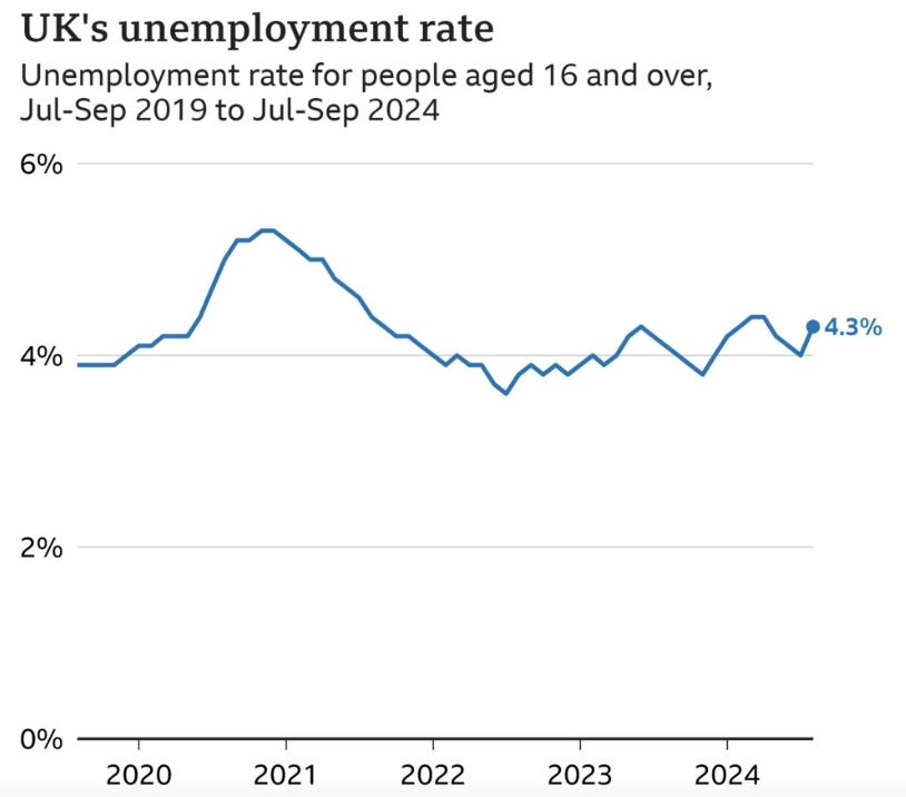
As always, it is important to contextualise your figures, but be mindful of:
seasonality (predictable and expected seasonal variations)
and the margin of error (generalised datasets based on samples)
With nearly everything being accessible online, hunting down change stories has never been easier. National statistics and open data reports are key to sourcing datasets for scrutinisation, and heading in with a hypothesis helps to provide a framework for such.
“While data journalism uses new sources, techniques and technology, in all other respects it is exactly the same as other journalism. We explore issues of public interest. We hold power to account. It is just that our sources, the things we “interview”, include databases and spreadsheets,” (Gouk, 2018).
3. Ranking Stories
Bradshaw (2024) states that ranking stories are all about the what, who, when, and where are the best or worst regarding particular metrics.
Ranking stories reveal the findings of datasets regarding a specific category or entity of interest (e.g. sports teams, holiday destinations, universities or other institutions), and may be angled around unexpected or controversial results. Like most data stories, they may arise from personal or general public follow-up queries around current news topics.

As seen above, ranking stories may take the form of listicles, sorting data based on a certain criteria or public-driven interest. Selecting your ranking metric is context specific, so identifying your audience and purpose is essential in generating a ranking story.
4. Variation Stories
Our final approach to generating data-driven news stories is the variation story. Where ranking stories are focused on structure, such as who or what is at the top or bottom, variation stories are led by the identification of difference itself, particularly where we least expect it.
For this reason, variation stories are often focalised around unfairness, presenting data variation where we expect consistency across particular regions or sectors.
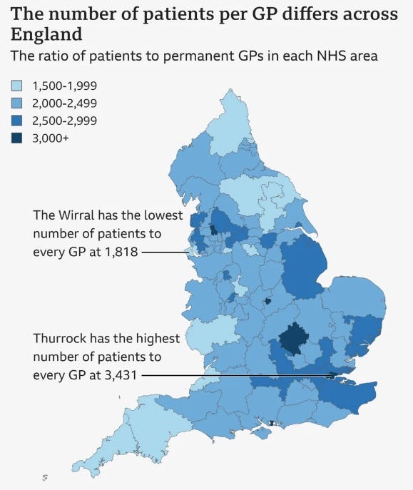
As seen above, Choropleth maps or heatmaps are classic examples of variation visualisations, depicting patterns and disparity in relation to a specific data variable. Your selected variable should directly correspond to your story’s angle and purpose, with insights relevant to your selected audience.
Data-Driven Feature Writing
Let’s take a look at the next four types of data-driven stories, which are predominantly used for deep-dives and longer feature articles.
5. Exploratory Stories
Our fifth type of data story is distinguished as exploratory data analysis, aka EDA, which is used to analyse and investigate datasets to summarise the data’s main characteristics in an engaging format. More often than not, you will see journalists using visual methods to display these stories, using charts, graphs and maps. These may be referred to as charticles.
The three techniques of EDA stories are as follows:
Descriptive statistics - Calculating basic measurements to understand the data distribution.
Data Cleaning - To identify and correct errors or inconsistencies in the data before analysis.
Data Visualization - To create visual representations of the data to identify patterns and outliers.
So, why choose an exploratory story?
EDA stories are a brilliant way to explore topical issues through a variety of different angles in a way that enhances data comprehension and audience engagement.

The data-backed insights and typical visual format of an EDA story helps to make chunky data more accessible and drive the ‘point’ of a story home.
For an example of an author-driven exploratory story, take a look at the 2023 Pulitzer Prize winning article, “We need to take away children” by Caitlin Dickerson.
6. Relationship Stories
Next, we have relationship data journalism, which is used to debunk or confirm suspected connections or relationships between different entities within a dataset. Essentially, these stories take a deep-dive into observed correlation between specific data points.
Remember: correlation is not the same as causation.
Relationship stories are designed to shed light on complicated connections and respond to a particular hypothesis, whilst making data accessible to a general audience.
These stories are often thought-provoking investigative stories which may disprove common misconceptions, or reveal wrongdoing, conflict or discrepancies, and are a great method for expanding your research and engagement skills.
Gabi Sobliye’s article on Investigating Googles revolving door is an interesting example of relationship data reporting and how journalism can be used to hold influential and powerful bodies accountable.
7. Needle in the Haystack Stories
Penultimately, we have the needle-in-the-haystack approach to data journalism, which involves the explicit search for suspicious or unethical behaviour, and often requires sifting through a mountain of data in hopes of finding a pot of gold.
As there is an abundance of data, journalists have to use advanced techniques to find the ‘needle.’ Here are some examples:
Filtering - the process of selecting and highlighting specific information
Machine learning algorithms - help to identify the patterns and anomalies within the data
This is by far one of the more tasking forms of data journalism, as it will take a thorough amount of research and comes with extreme challenges. These challenge can include sourcing, retrieving and collating large quantities of reliable data, and ultimately having the time to examine it all.
However, once you’ve hit gold, you are likely to have sourced an original and newsworthy story that can have widespread effects that may lead to real change. This approach often acts as a springboard for further investigation, giving you an idea of where to look further, and ask more questions.
A data leak from the database of the world’s fourth biggest offshore law firm, Mossak Fonseca, led to the exposure of one of the biggest recorded scandals in data journalism history, referred to as the Panama Papers. The investigation into the leaked data is an example of the value of data journalism and the necessity of this approach.
8. Get-the-Data Stories
Lastly, we will delve into the ‘problems of data quality’ reporting, regarding articles focalised around difficulty retrieving data, and the act of holding institutions and powerful bodies accountable for neglecting transparency. These stories can come from existing complaints, fact-checking, scrutinising data or by simply noticing a lack of or missing data.
Why do journalists explore this approach?
Although all stories have importance, problems with data quality can be exceptional, as there is trust within data. Readers exercise a level of trust when viewing data that is put out there, as it is somewhat a given that the data is fact. Therefore, when ‘get-the-data’ stories are published it can uncover much more than just the quality of the data originally published, it can look into organisations or people in power and how trust-worthy they are. This form of data journalism is tightly connected to journalism’s watchdog role and delivery of justice.
Here’s an example by the BBC highlighting problems of data quality: Gender pay gap: Charity questions accuracy of data.
Where to look for data
To finish off, we have put together some useful data sources to explore as you embark your adventure into the digital realm:
Specific organisations, institutions or agencies often release datasets or reports publicly. - The Office of National Statistics is widely used by journalists.
Create your own data - survey, polling and interviewing are great ways to gather the data, but be mindful that there are limitations, for example the quantity of applicants, reliability, and bias.
Freedom of Information request (FOI) - Through ‘What Do They Know’ you can access existing FOI requests or make your own to help gather data.
Statista - perfect for pre-existing datasets that are made into visual data.